 Just as it was very hard to believe that someone could have a business without a phone number or business cards to share in the 20th century, it is very hard these days to believe that someone has a business without a website or an e-mail to share with potential customers. Having a website has become a need… a proof that your company exists and that it is serious too. If you don’t believe me, ask yourself how willing would you be buying from a company you cannot check out on Google.
Having a website just for the sake of having one to show (or show off? —not always), however, is one of the most common mistakes we see at InTechCenter, a web design and development company. There are millions of websites which are yet another virtual letter of presentation out there: First a slideshow displaying a few pictures of your work or services, next an About Us page, next “products” or “services” page (if applicable), and finally a Contact Us page. Oh! And I almost forgot, a few links to your social media profiles either on top or at the bottom of the site too.
Here are the must haves on a successful website.
1. Compatibility
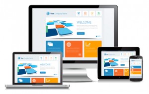
Successful websites work well on any device with an Internet connection: desktop and laptop computers, PC or Mac, tablets and phablets (i.e. iPhone 6 Plus or Samsung Galaxy Note), mobile phones and appliances with Internet connection like a TV or a gaming console. You never know where your potential user will be, so it’s good to make sure your website has a responsive design to work everywhere, yes, everywhere!
2. Speed
Successful websites are fast. How fast? Lightning fast. If you can take it to the “oh-when-the-heck-did-this-web-page-load” level, much better. There are many studies showing that the longer a website takes to fully load on a visitor’s browser the higher user abandonment rate is. Ideal loading time is one second. Beyond two seconds, people start clicking away. Beyond ten seconds, forget it —if they are not your fans, they are somewhere else already.
3. Clear objectives
You have a company, great. You have a website, great too. Yet if you do not have clear objectives in mind as to what you want to get from your website, it may never grow to bring you the business it should. Talk to your web designer about what goals are you trying to achieve and how they are planning to get those goals accomplished with the design. The keyword here is “clear”. The clearer you have your goals set, the better.
4. Intelligent content
Regardless of how popular YouTube is, the web is still mainly a written means of communication. People buy for what they read, so make sure your site has intelligent text which will (1) showcase what you sell, (2) introduce its benefits while kicking away any doubts a potential client may have, and (3) show them how to get your product or services. That’s exactly how successful websites make profits for their owners. Yes, wrapping it up, it is this simple.
5. Internet marketing
Not a must, but decidedly a plus. Unless you have just invented something and have a worldwide patent, most likely you will have competitors for what you do. So, if you want to drive business to your company, you may want to consider getting a decent position on search engines and some traffic from social networks and other sites. Well, that’s what Internet marketing is for, and something you may want to invest in too.
What you may not need on your site
There are a few things your site may need less of to be successful. I think it is fair to add some of these to the article too:
Animations
They are nice, eye-catching, and even sweet sometimes, but if your objective is to get clicks and sales, then animations are sometimes a distraction from the objective instead of an aid. Evaluate the advantages of getting animations with your designer before just saying yes to the suggestion.
Lengthy contact forms
Name, e-mail and message are usually enough in most contact forms. If you are to include any more input fields, make sure you really need them because the user may not want to fill out lengthy forms, costing you a lead to a potential sale.
CMS (which stands for Content Management System).
Now and then I wonder why some web designers use a heavy CMS to create a website that is just 4 or 5 web pages large. CMS are great but they are not the panacea for everybody’s needs. Ask your designer if you really need a full CMS for your site, or if just a backend will do. You may even save some money in the design cost if you do.
Well, that’s it for today. I hope this article will help you focus on what you really need for your site, ditch what you don’t, and all in all help you get the results you are looking for. If you have any question or suggestions, please post your comments below.

I definitely agree with point 2, a slow website is so off-putting for visitors. It can be really frustrating.