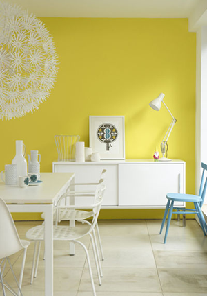
 Matching colors in your house can turn out to be very compromising. That’s why we always think that only the design professionals can succeed!
But we have another suggestion: do it yourself and in order to succeed, here are 5 common mistakes that you can avoid to get a charming result!
Mistake 1: matching more than 3 colors
It is a primary rule in decoration: never associate more than 3 colors in the same room. In fact, mixing 4 or more colors can be confusing!
The best thing to do is to mix 3 shades of the same color; for example, match 3 shades of pink in the same your of course each one in different degree.
Mistake 2: going for bright colors
Usually in a room, the eyes are attracted by the most powerful color. So when there are too many bright colors in the same place it becomes hard to bear for the eye.
For that reason, it is important to think carefully about the color you want before you hazard into painting!
Mistake 3: making wrong color matches
There must be a balance in color matching.in fact, there are some colors which should not be put together: violet and yellow, red and green, blue and orange… these colors fight each other and the result can be disastrous.
If you wish to avoid a deceiving outcome, try to go for smooth and natural colors. For example, scarlet red with a touch of off white.
Mistake 4: forgetting about existing colors
Sometimes, we just want to change the design surrounding us and we forget that the house already contains colors, be it on the furniture or the walls. As a result, you end with a lot of colors that don’t match.
Try to get a global view of what you already have, and then decide what color goes with what you already have!
Mistake 5: think that colors can be only on the walls
In painting, as we said earlier you can go for shades, light and dark, but not just on the walls.
Indeed, you can play with colors on the walls, the roof, or the door and all the wood work you have in the room. Don’t limit yourself in one space and play with colors as much as you want!

One conversation dominated the interval chit-chat at our group conference chat is the color combination and most mistakes when choosing the painting combination. I saw your page on search result, send the link to them and now it is dominating. Thanks for posting these 5 tips!